|
||||||
|
||||||
|
This example will illustrate why a straight line and what you can do with a graph:
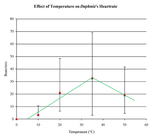
The graph below shows a direct relationship up to the optimum temperature and then an indirect relationship above that temperature. Note, we can predict the maximum and minumum temperatures at which the heart stops. The hi-lo bars are used to show the range of data collected at each temperature; the red points are the average for each temperature, Is it possible that no heart beat at the exact temperatures denoted by the red points? Look at the titles: they are designed to tell the reader what is happening. The graph is "The effect of…" because it is showing the effect of the X axis on the Y axis. Note: these are not real data. You will need to use your class data.
|

 Draw
best fit lines. The straight line should reflect the
trend of the points so there are an aqual number of points above the
line as below. Lines do not need to touch the points because they are
an interpolation of events between data collection.
Draw
best fit lines. The straight line should reflect the
trend of the points so there are an aqual number of points above the
line as below. Lines do not need to touch the points because they are
an interpolation of events between data collection.